An engraved whiskey glass carries a small amount of information unusually well. A familiar name identifies its owner; a date gives a shared occasion a permanent place on the glass. The design becomes more personal when that detail is easy to recognize at the moment the glass is picked up.
The challenge is scale. Words that look balanced on a screen can become crowded on a curved bowl, especially when a logo, border, and dedication all compete for the same area. Choosing what matters most is the beginning of a clear design.
The Glass Sets the Dimensions
Choose the glass before finalizing the artwork. A narrow tasting glass and a broad rocks glass give you different shapes to work with. If you're still deciding, our Glencairn versus rocks glass gift guide explains which suits neat whiskey, ice, and cocktails.
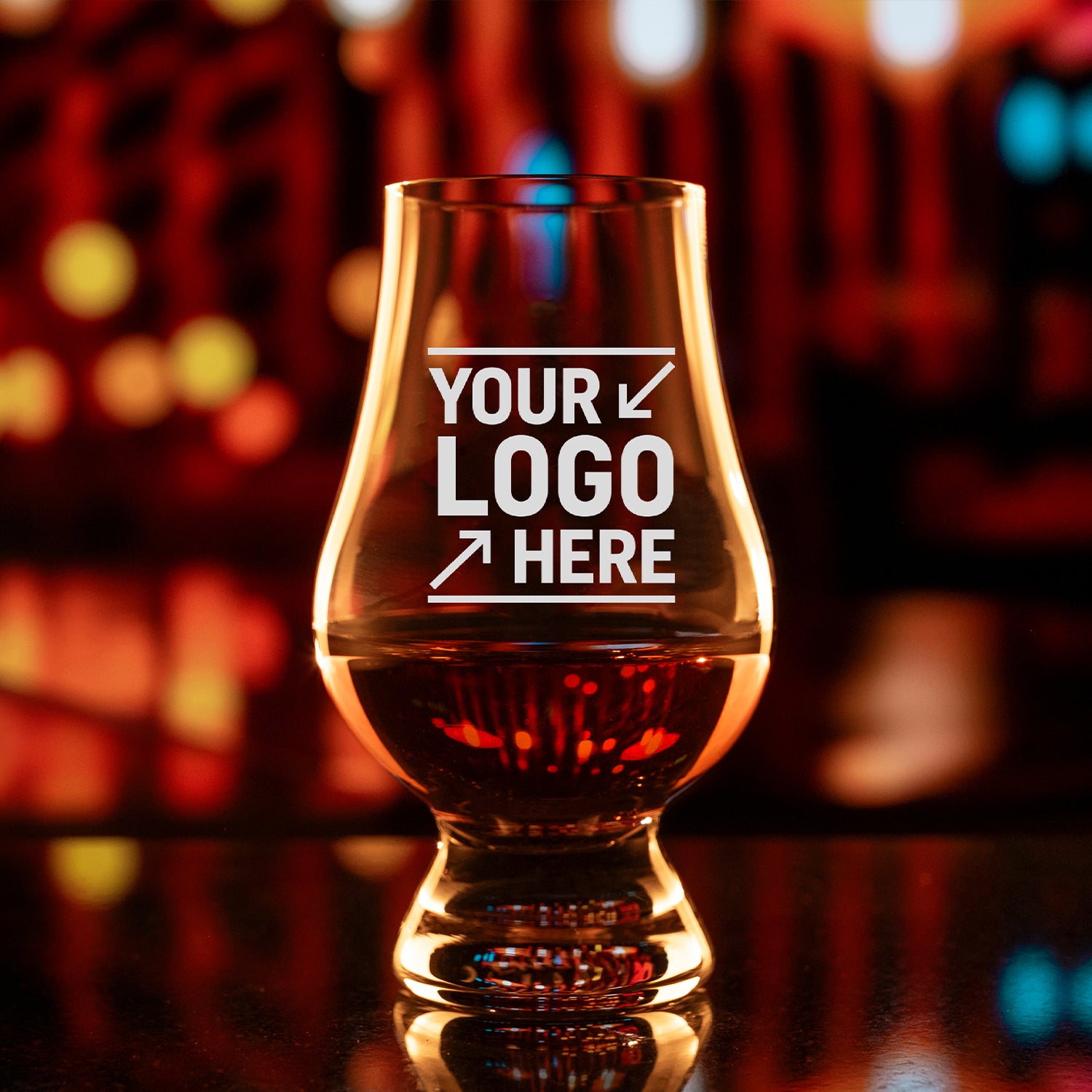
The personalized Glencairn Whiskey Glass lists a maximum logo size of 1.4 inches wide by 1.4 inches high. That's a useful boundary for planning this particular product, not a standard size for every glass BevZap sells.
At that size, space becomes part of the design. A short name can remain prominent, with a date beneath it. A longer dedication uses the same area very differently, often leaving less room around each letter. Drawing the available square on paper helps put those choices in proportion.
Personal Details Give the Design Its Purpose
A strong layout gives the eye somewhere to begin. The name or main symbol can carry the design, with a smaller line explaining the occasion. The following ideas are starting points; the chosen glass and typeface determine how much wording will fit comfortably.
Names and Initials: A Glass for Everyday Use
A first name is often enough for a gift that will get regular use. Initials are an option when you want less lettering, but write them in the exact order you want engraved. Don't assume everyone follows the same monogram convention.
- JAMES as a single line.
- R.T. for a compact initials design.
- Maria's Glass for a straightforward personal label.
Longer names often benefit from a quieter layout. Without a decorative border or several supporting lines, the lettering can remain large enough to read and still feel balanced on the glass.
Dates That Keep the Occasion Clear
Two names with a date underneath give the design a natural reading order. For example, “Alex & Morgan” above “June 14, 2026” identifies both the people and the occasion without a long explanation.
Spelling out the month avoids the ambiguity of dates such as 06/07/26. If a shorter numeric date is important to the design, confirm the intended order with the person placing the order. Check the year separately; it's easy to keep looking at the names and miss one wrong digit.
Milestones in a Few Words
A short phrase works when the recipient immediately understands its meaning. “Cheers, Dad,” “The Next Chapter,” and “Class of 2026” suggest different occasions without explaining the whole story. A private joke can do the same work when it belongs to the relationship.
The card can carry the longer dedication. On the glass, the most meaningful few words have room to stand on their own.
A Shared Identity for Clubs and Businesses
Club and business designs involve a different choice of emphasis. A club name with an anniversary year celebrates the group, while a recipient's name makes a business gift more individual. A logo can support either approach, but all the elements don't need equal size.
If a logo includes a tiny slogan or detailed seal, ask whether a simpler version would suit the glass. Keep the full design available for review rather than deleting elements without the organization's approval.
Readability Depends on the Finished Size
BevZap's artwork requirements specify text at least 0.08 inches tall when the logo is reduced to the engravable area. That is about 2 mm. Treat it as a minimum requirement, not a promise that every typeface will look equally clear at that size.
Visible letter height matters more than the number in a font menu. Two typefaces set at the same point size can produce noticeably different lettering. Fine strokes, flourishes, and tightly spaced characters also become more demanding as the design gets smaller.
A useful home check is to print the design at the proposed engraving dimensions, with printer scaling set to 100%. Read it without zooming in or bringing it right up to your face. Paper won't reproduce engraving on curved glass, but it will quickly show whether the wording depends on being enlarged to make sense.
A crowded design usually benefits more from editing than from shrinking. Removing a secondary line or shortening the message leaves the main detail readable. A border is useful only when it supports that detail.
Artwork Quality Starts with the File
A clear screenshot is useful for explaining an idea, but it isn't necessarily production-ready artwork. BevZap's guidelines call for vector artwork, such as an AI, CDR, EPS, or vector PDF file. Saving a photograph or screenshot inside a PDF does not turn it into vector artwork.
For text within a logo, the guidelines ask for typefaces to be converted to paths or objects, or for the font files to be supplied. This helps communicate the intended lettering instead of relying on a font that may not be available when the file is opened.
If all you have is a PNG, JPEG, or sketch, send what you have for assessment and ask about any artwork preparation costs before proceeding. Don't assume changing the filename or file extension solves the problem.
Consistency Across a Personalized Set
A group order combines a shared design with details that change from glass to glass. One master list keeps those variations clear: a reference number for each version, its exact wording, and the quantity required. It also gives later corrections a single place to live.
For example, an order might contain six glasses with the same club logo and six different names. That is six personalized versions of a shared design. Make the distinction explicit so “quantity six” can't be mistaken for six copies of one person's glass.
The recipient list deserves its own careful reading. Apostrophes, accents, and initials are small marks with personal importance, and an unfamiliar name can look plausible even when it is wrong. Someone who knows the recipients is often best placed to check it.
The Review That Brings the Design Together
Wording and layout deserve separate attention during review. Reading the names, dates, and punctuation against the master list catches content errors. Looking at the design afterward makes it easier to judge the balance: the first element you notice, the size of the supporting line, and the space around both.
Consistency doesn't always mean identical spacing. A short first name and a long surname may need different line breaks to look like members of the same set. Reviewing the longest version alongside the shortest makes that balance easier to judge.
Before ordering from BevZap's custom glassware collection, check the final layout against the specifications for your chosen product. Keep a copy of the final wording and approved artwork with your order details so there's one clear reference for what you intended.